

Review: Edison Collier Persimmon Swirl, 1.1mm Italic
- KraftyChloé

- Mar 13, 2022
- 3 min read
Take some lava, fashion it into a fountain pen, and you have the Edison Collier Persimmon Swirl.
Of course, unlike lava, this pen won't inflict thrid-degree burns which I feel is an important trait for most writing instruments. What I'm trying to describe with this comparison is the depth of colour - a vivid orange with areas of shimmery pale tangerine, highlighted with striking black and white streaks.
It did, in fact, look like the orange sibling of the red/pink Newton pen I reviewed previously. I only realised that they weren't relatives after I saw the etchings on the barrel and nib informing me it is an Edison Collier.
They do share some characteristics (including superior build quality). While the Newton is chunkier than this pen, the Edison is still quite fat. The sections are also equally comfortable to hold - both are light but sturdy, and the barrel sits nicely in the hand.
The similarities end at the nib, however, because this particular Edison has a 1.1mm italic nib.
I adore italic nibs.
They just seem to make everything look better, somehow. Even without flex, you can achieve a good amount of line variation in your writing, and you don't even have to be writing in italic. I haven't yet met an italic nib that is too wet, nor one that skips or dries up while writing. They also show off effects such as shimmer, sheen and shading better than other nibs.
That's my experience, at least. Others may think differently, and that's fine because we all have our own individual opinions and tastes in fountain pens. If you happen to agree with me, you won't be disappointed by the italic nib in this pen.
To access the it, you unscrew the cap. As you can see, it has a smart gold clip.
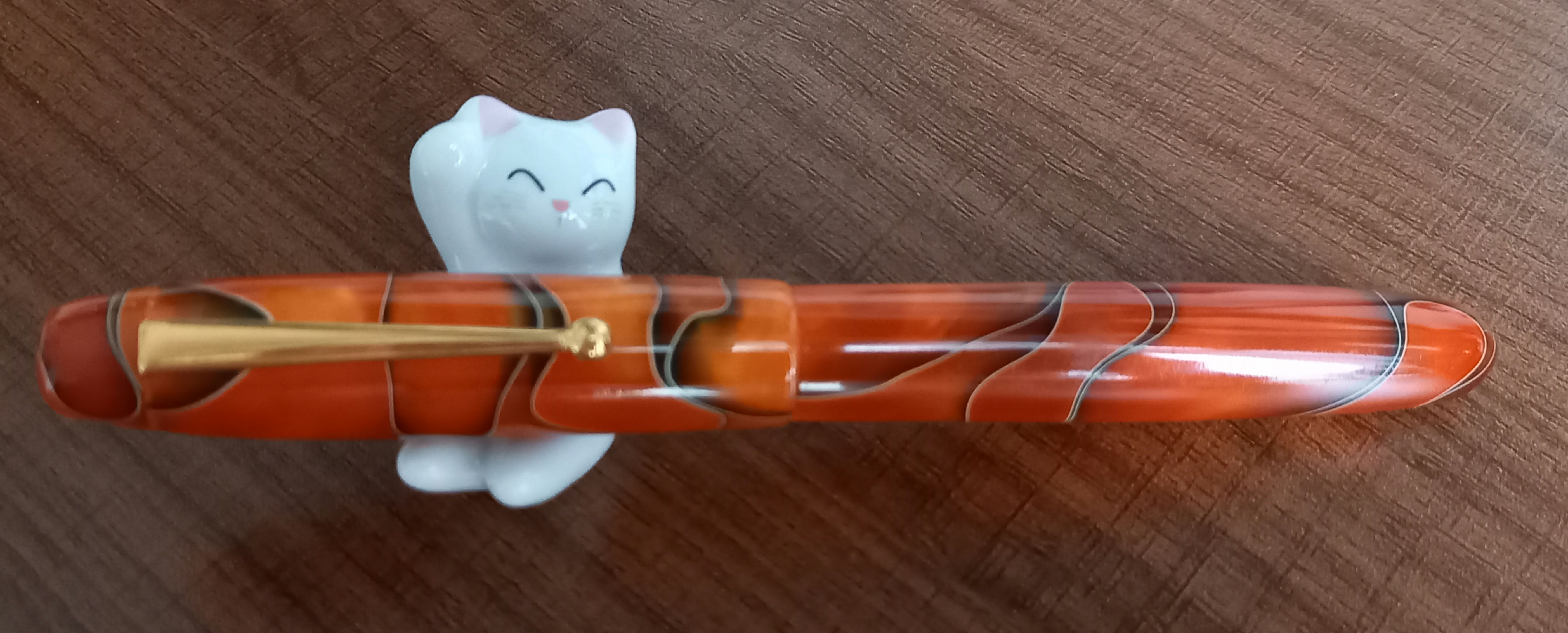
The threads are smooth, and I found that you can also unscrew the top of the cap to remove the clip.


This means you can have it as a clipless pen if you wish, but you will be left with a little rectangular hole. It doesn't bother me, but some discerning pen enthusiasts may be vexed by the gap.

(Ooh look, I put an arrow there! Still can't figure out how to control picture size though...)
You can't post the cap, the end of the pen it too large. It is possible to push it on and it will sit there precariously, but posting really isn't necessary in such a well-balanced pen.
The nib is a split of two colours, gold and silver. The breather hole is a simple circle, and below it is etched 'Edison' with a little fountain pen logo above the name. The whole thing is embossed with some pretty lines.
As I mentioned before, italic nibs never fail to impress me and this one is not an exception. It glides freely across the page, laying down a consistent line. There is the ghost of a scratch, but I think it is due to the way I hold the pen rather than a fault in the nib.
To get to the converter in order to fill it with ink, you unscrew the barrel. Inside is a generic friction-fit converter with good ink capacity. I always prefer converters that screw in after an incident which ended with me sieving some ink because the whole section had fallen in the bottle. Luckily this one seems to fit firmly enough. I'm also much more careful after that interesting experience!

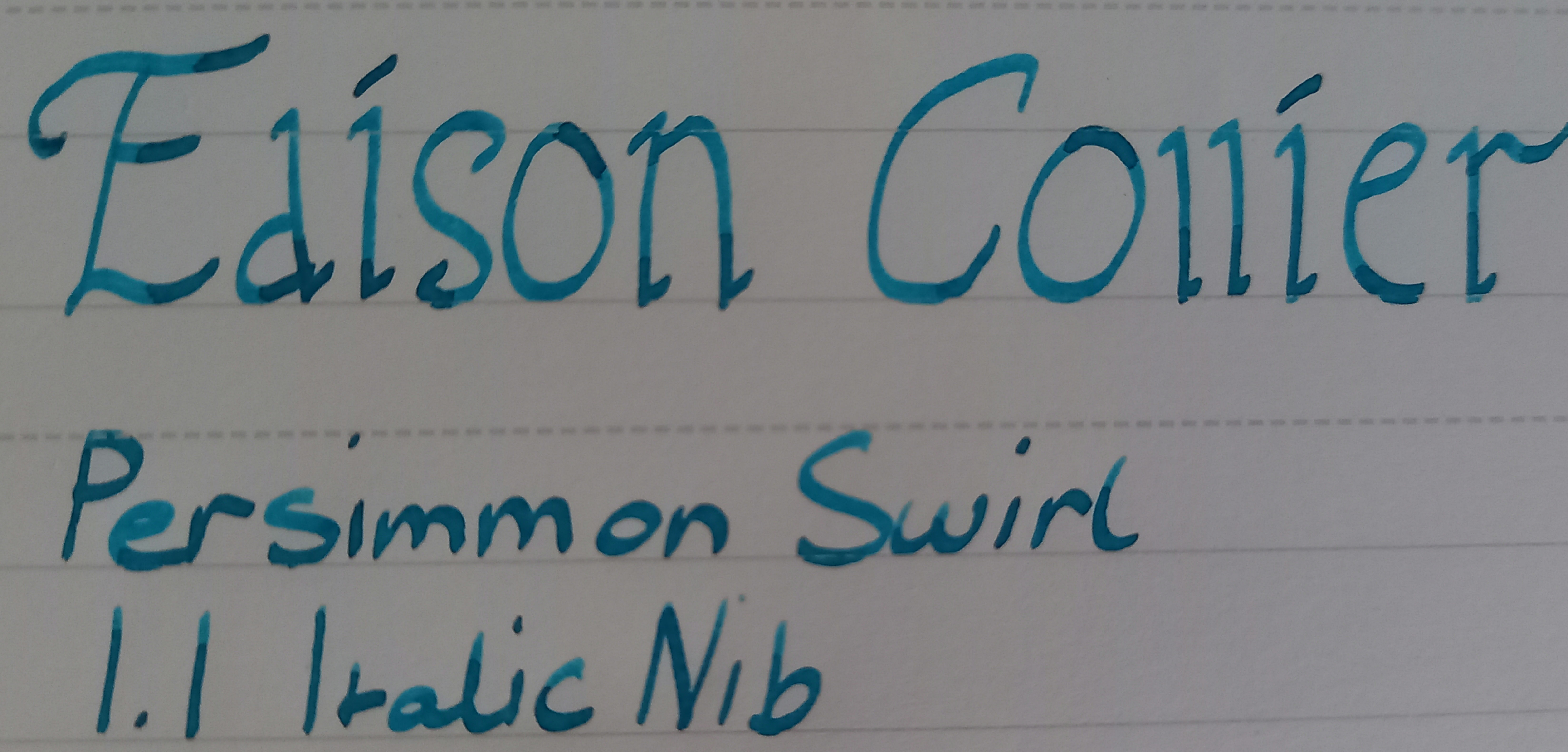
The feed releases just the right amount of ink. I filled the converter with Robert Oster Signature fountain pen ink, Pacific Ocean Teal. It is a nicely balanced ink, not too wet or dry, and the pen seems to like it. As you can tell from the writing sample further up, there is a lot of shading when I write with it, and the italic nib really shows an already brilliant ink at its best.
I am impressed by this pen. The combination of a stunning design, beautiful and functional nib, and great ink capacity make it a pen I'll have in regular rotation. It is a very good first taste of an Edison Collier pen and I have no doubt that I'll be adding a few more to my collection in years to come!


Comments